
Local Logo Redesign - St. Paul, Minnesota
Welcome to another edition of Local Logo Redesign. Today we’re in St. Paul, Minnesota looking at Fytenburg Brewing Company.
The existing logo has some small issues, but in general doesn’t portray a sense of high quality. The color palette isn’t helping with the overall feeling of the brand.
For this redesign, we’re focusing on bring a sense of quality to the brand and making it feel a little bit more expensive. A cohesive brand can really change the way people view your product.
We’ve created a typeface that has some of the same feeling of the existing, but is a little cleaner and easier to use in lots of different applications.
We’ve designed a badge logo to go along with this redesign in order to use it on merchandise and packaging.
To provide a comprehensive view, we'll showcase the logo on different items, including asign, a quick can mock-up, and what that badge might look like on a glass.
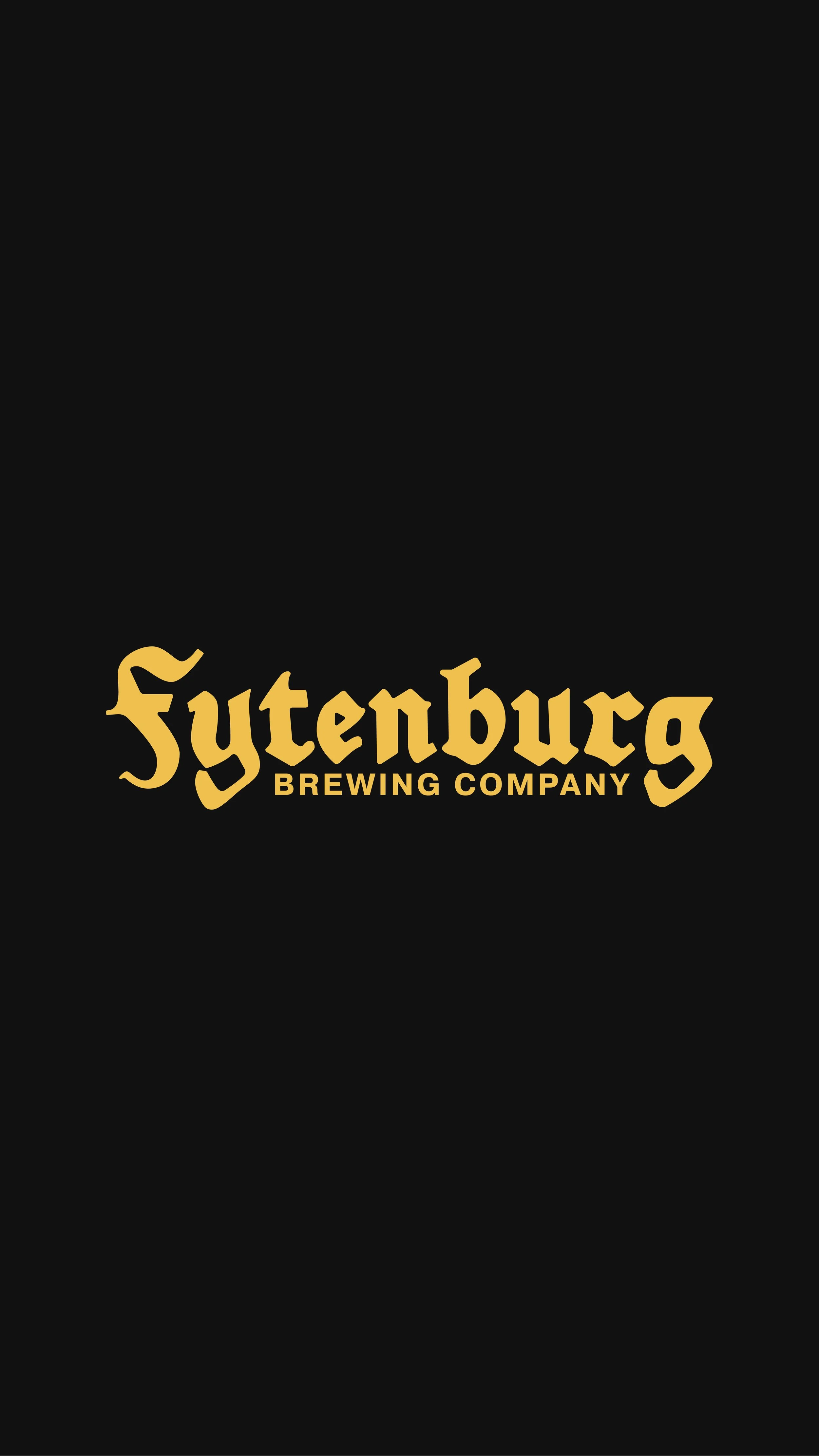
Here's the updated logo with its brand colors, emphasizing the custom typeface.


In the ongoing saga of Local Logo Redesign, Fytenburg Brewing Company in St. Paul, Minnesota joins our ranks of businesses getting a conceptual visual facelift. Stay tuned for more, and if you're in the market for a standout brand identity and logo, drop us a line. Let's brew up something uniquely yours.
Talk to you soon,
