AEC Branding Services
AEC branding is the strategic and creative work of defining how an architecture, engineering, or construction firm presents itself to the clients it wants to attract, the talent it wants to hire, and the market it wants to lead.
It is different from general business branding in ways that matter. AEC firms compete on reputation in markets where relationships drive referrals and where credibility is evaluated before the first conversation happens. The brand signals that matter to an architecture firm's target clients are not the same signals that matter in consumer or tech markets. The positioning work that helps a construction company win a $5M commercial contract is fundamentally different from the positioning work that helps a retailer attract foot traffic.
AEC branding services typically include brand strategy and positioning, brand identity design, messaging frameworks, and the website and digital presence that carries the brand into the market. Done well, it is not a sequence of disconnected deliverables, it's a single coordinated system built around a clear answer to one question: Why should the right client choose your firm?
In most AEC markets, the firms winning the best work are not always the most technically capable. They are the most clearly positioned. A firm that can articulate exactly what it does, who it does it for, and what makes it the right choice, and that communicates all of that consistently across its brand and digital presence, wins more opportunities to prove itself than a firm with equivalent capability and weaker positioning.
The cost of weak branding in the AEC industry is real and specific. It shows up as:
Lost project opportunities to firms that look more established on paper. Proposals going out that do not reflect the quality of the firm submitting them. Strong candidates choosing other firms because the brand does not signal the kind of place worth growing with. Referral partners struggling to describe your firm precisely to the people they send your way. New markets that are hard to break into because the positioning is too generic to register.
A focused AEC branding engagement addresses all of these problems from their root. Not by making the firm look different, but by making it communicate more clearly, consistently, and credibly.
The foundation of everything else. Before any design work begins, we define your positioning — who your firm is for, what makes it different from competing firms, and how to communicate that in a way that resonates with the clients you want to attract. This is where AEC branding starts for firms navigating a transition, entering a new market, or simply ready to get clearer on their direction.
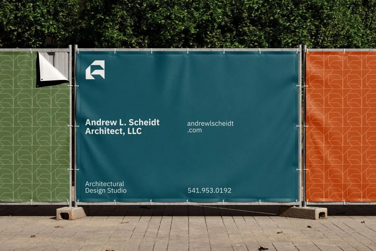
The visual and verbal expression of your positioning. Logo system, color palette, typography, brand voice, and brand standards — built to hold up across proposals, signage, your website, and every other context where your firm shows up. A complete identity system, not a logo in isolation.
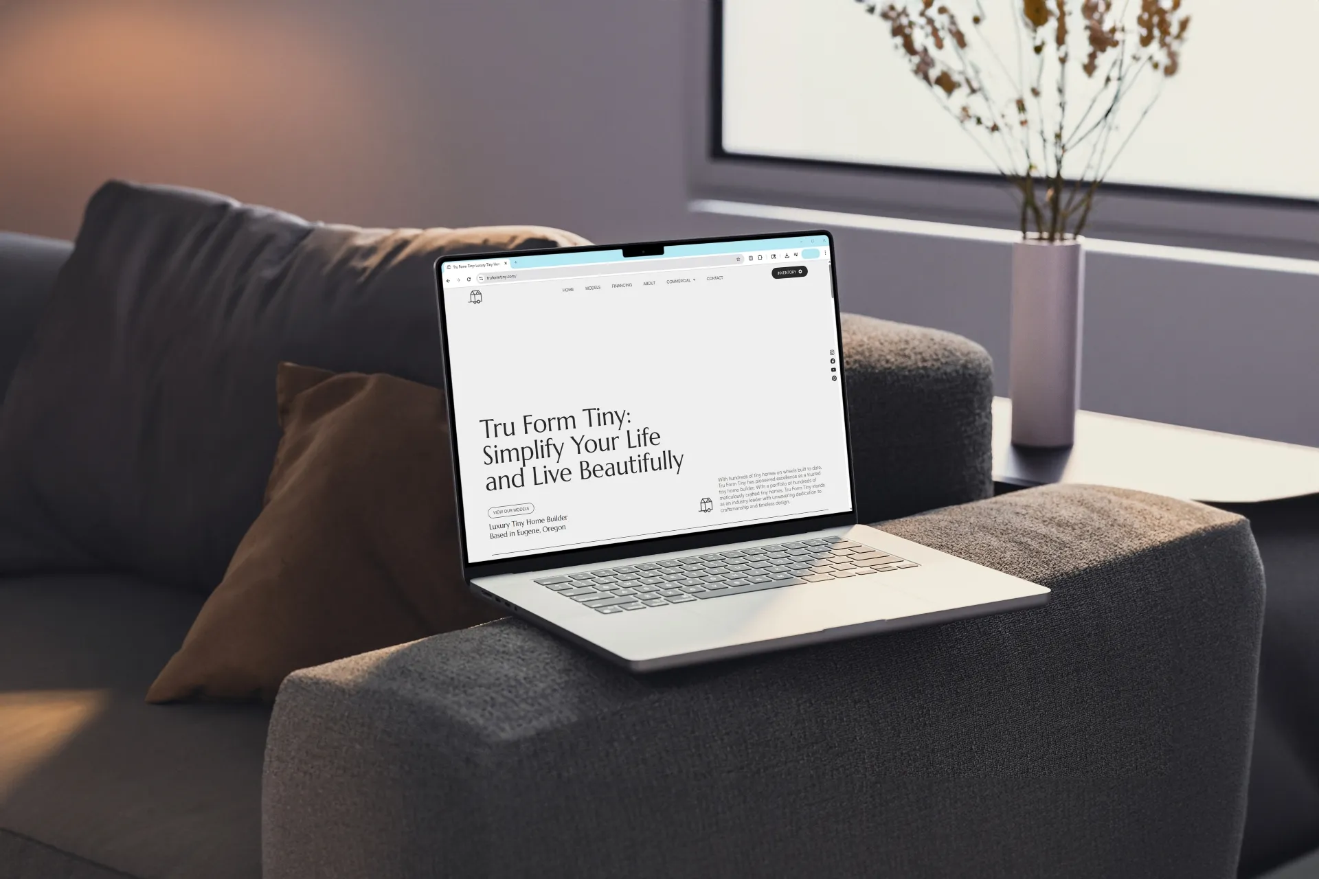
Your digital presence is where your brand lives in front of the clients, candidates, and partners who do not already know you. We design and build Webflow websites that position AEC firms clearly, showcase project work with the context it deserves, and function as genuine business development tools.
Fairbuilt works with architecture firms, engineering firms, construction companies, and real estate development firms across the Pacific Northwest and the country. We are a specialized AEC branding company — we do not work outside the built environment, which means every engagement benefits from the industry context we have built across years of work with firms like yours.
The firms we work best with are typically:
Growing studios that are serious about the next phase of their practice and ready to invest in the brand infrastructure that supports it. Firms navigating a leadership transition, ownership change, or significant strategic shift. Practices entering new markets or project types that require a repositioning of how they present themselves. Companies where the quality of the work has consistently outpaced the quality of the brand representing it.
Most branding agencies are generalists. They work across industries, which means every AEC client engagement begins with a significant education process — teaching the agency how firms win work, how reputation drives referrals, what an RFP process looks like from the inside, and what it means to build a brand in a market where trust accumulates over decades and a single mispositioned identity can set a firm back years.
Fairbuilt was founded by Brad Phillips, who spent years practicing architecture before launching the studio. That background is not a differentiating claim for its own sake — it is the reason every AEC firm branding engagement we run starts from a position of genuine contextual understanding rather than borrowed vocabulary.
We understand how architecture firms grow, how construction companies build reputation, how engineering firms communicate technical credibility, and what it takes to win in each of those markets. You will not spend the first third of our engagement teaching us your world.
AEC stands for architecture, engineering, and construction. It is the collective term for the interconnected industries of the built environment — the firms that design, engineer, and build the physical world. AEC branding refers specifically to the brand strategy, identity, and marketing work done for firms operating in these industries.
We work most effectively with small to mid-sized firms — typically between three and 100 people — that are growing and ready to invest in the brand and digital presence that reflects where they are headed. We have done excellent work with firms at both ends of that range. What matters more than size is where the firm is in its growth and whether leadership is ready to engage seriously with the positioning work that makes everything else more effective.
Yes. We are based in Portland, Oregon, and have a strong footprint in the Pacific Northwest AEC community. But we work with firms across the country. Our process is designed to run effectively remotely, with structured video working sessions at key phases. Geography has not been a barrier for any of our national clients.
AEC firms operate in markets with specific dynamics — long sales cycles, relationship-driven business development, reputation-dependent growth, and clients who evaluate vendors through a different lens than consumer markets. AEC branding accounts for those dynamics. The positioning work, the identity design, and the digital strategy are all shaped around how AEC firms actually win work and build reputation — not around frameworks imported from consumer, tech, or retail branding.
Yes — and this is often an underappreciated dimension of AEC branding work. A strong brand presence affects how your firm is perceived by candidates as well as clients. In a tight talent market, AEC firms with clear positioning, a compelling culture story, and a professional digital presence consistently attract stronger candidates than firms with generic brands. We factor this into both the strategy and the identity work.
Scope and investment vary by engagement. A focused brand strategy engagement typically starts in the mid-four figures. A complete brand identity system is a five-figure investment. A full engagement covering strategy, identity, and a new website is a more significant commitment — appropriate for firms that are serious about building the right foundation once rather than fixing it incrementally over years. We are transparent about investment levels before any project begins. Reach out and tell us what you are working on and we will give you an honest picture quickly.