

Location:
Eugene, Oregon

Type of Work:
Brand Identity

Completion Date:
April 2026
Eugene, Oregon
Brand Identity
April 2026
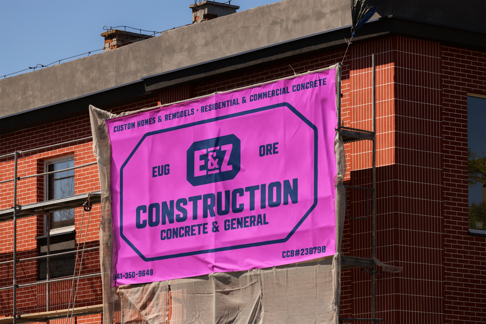
E&Z Construction, a Eugene, Oregon construction company, had reached an important stage of growth. The company was winning projects, building a strong reputation, and expanding its presence, but its brand no longer reflected who they had become.
The existing identity wasn't necessarily broken. It simply didn't communicate the quality of the work, the professionalism of the team, or the personality that clients experienced throughout the construction process. Every proposal, business card, and job site represented a missed opportunity to reinforce the company's reputation.
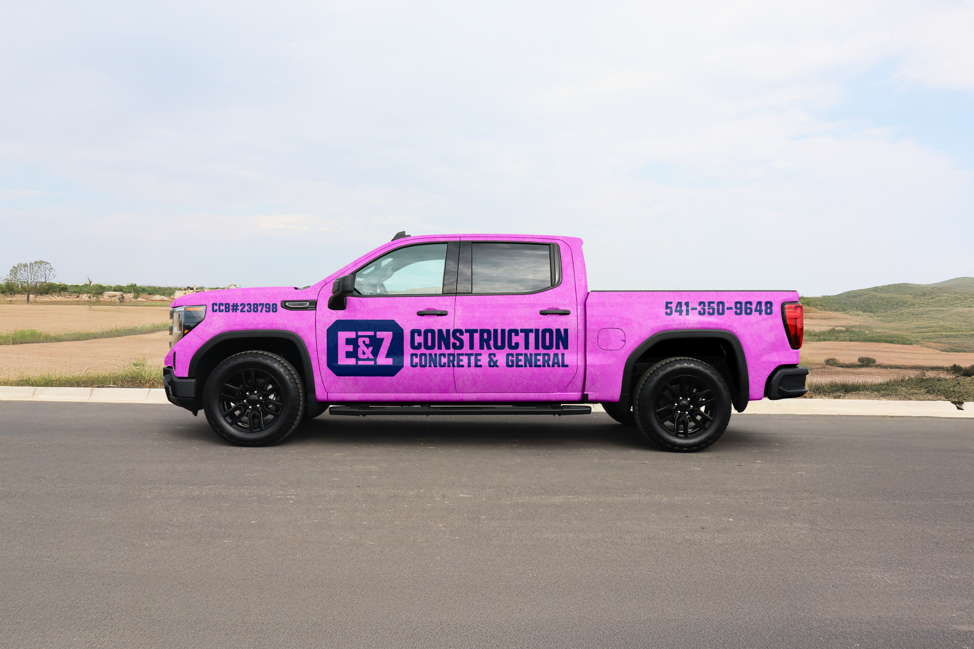
The immediate catalyst was a practical one. E&Z wanted to introduce partial vehicle wraps across their fleet, but the existing identity wasn't designed to perform at that scale. As conversations progressed, it became clear the challenge extended well beyond truck graphics.
The company didn't need a new logo for the sake of change. It needed thoughtful Construction Company Branding that better represented the business they had worked hard to build.
Every branding project begins with brand strategy before design.
We spent time understanding the company's culture, long-term goals, ideal clients, and the qualities that consistently set E&Z apart from competitors. Those insights became the foundation for every design decision that followed.
One of the project's most interesting constraints became one of its greatest strengths.
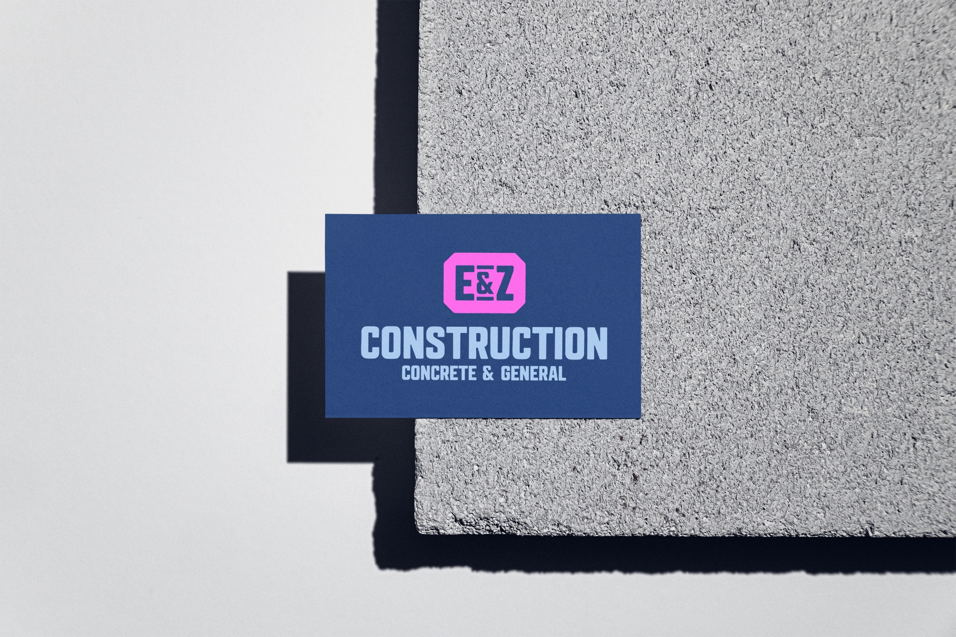
The team wanted to retain their existing blue and pink color palette. An unusual choice within the construction industry, where many brands rely on the same predictable combinations of black, red, orange, or yellow. Rather than replacing those colors, we refined them.
The blue became a deeper, more confident foundation that conveyed stability and professionalism. The pink evolved into a vibrant accent color that increased visibility while giving the company a memorable visual signature. Together, the colors created a distinctive identity that immediately separates E&Z from competitors while remaining highly functional across vehicles, signage, apparel, and marketing materials.
From there, we developed a complete brand system including a primary logo, responsive logo variations, supporting visual elements, and vehicle graphics designed to perform across every application.
As a studio specializing in Construction Branding and AEC Branding, we believe the strongest contractor brands aren't built around industry clichés—they're built around the unique character of the business itself.
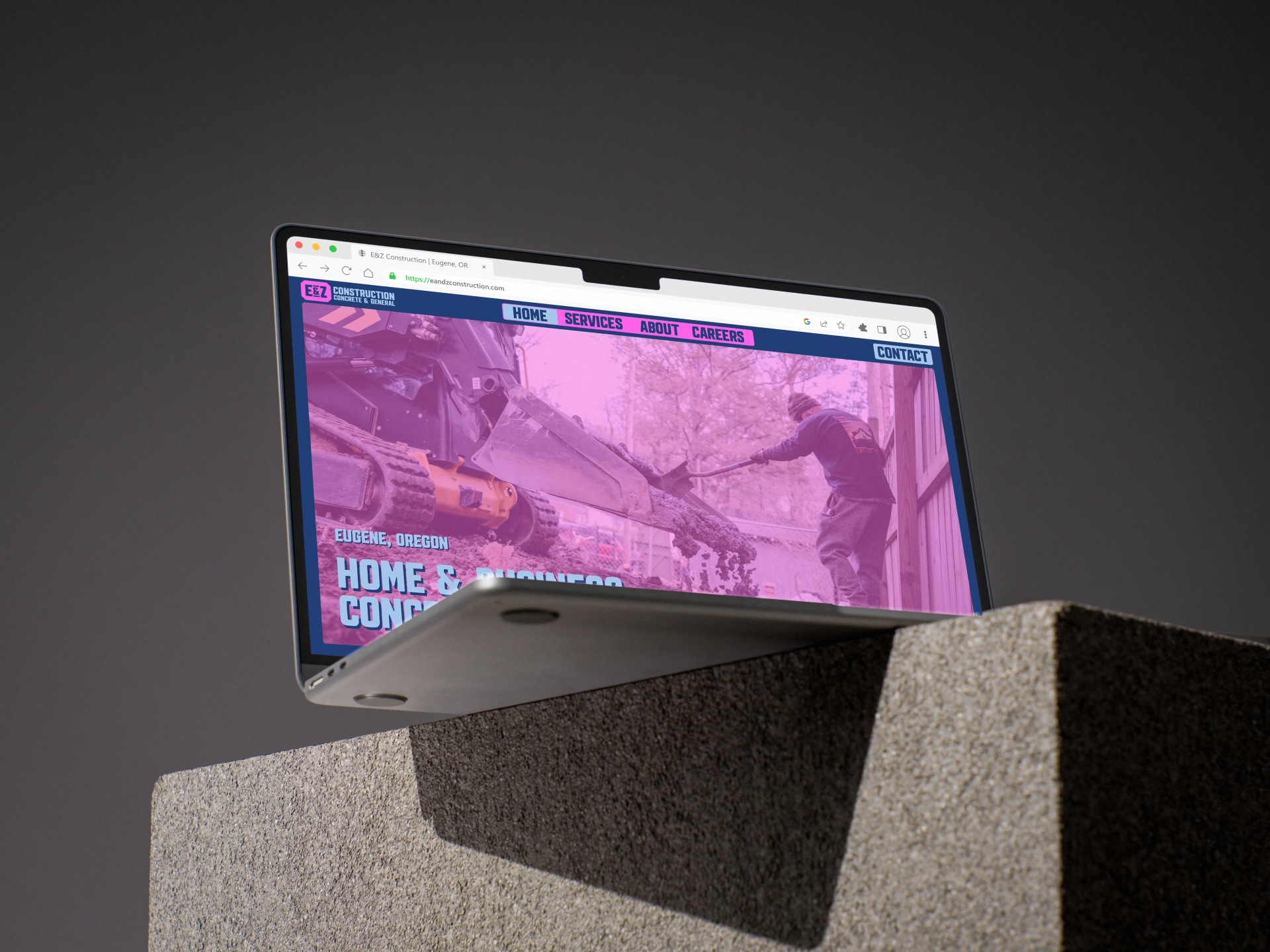
E&Z Construction now has a brand identity that accurately reflects the professionalism, craftsmanship, and personality behind the company.
The new identity creates consistency everywhere the brand appears, from proposals and business cards to job site signage and company vehicles. More importantly, it provides a flexible foundation that can continue evolving alongside the business without losing recognition or consistency.
The vehicle wraps have become one of the most visible applications of the new identity. Every truck now functions as a moving advertisement, reinforcing the brand throughout the communities where E&Z works. For construction companies, fleet graphics are often one of the most effective long-term marketing investments because they build recognition every day without additional advertising costs.
This project demonstrates that Branding for Construction Companies goes far beyond designing a logo. A strategic brand creates consistency, builds trust before the first conversation, and helps growing contractors communicate the same level of quality that clients already experience on every project.
Interested in strengthening your company's reputation? Learn more about our Construction Branding and Brand Strategy services.
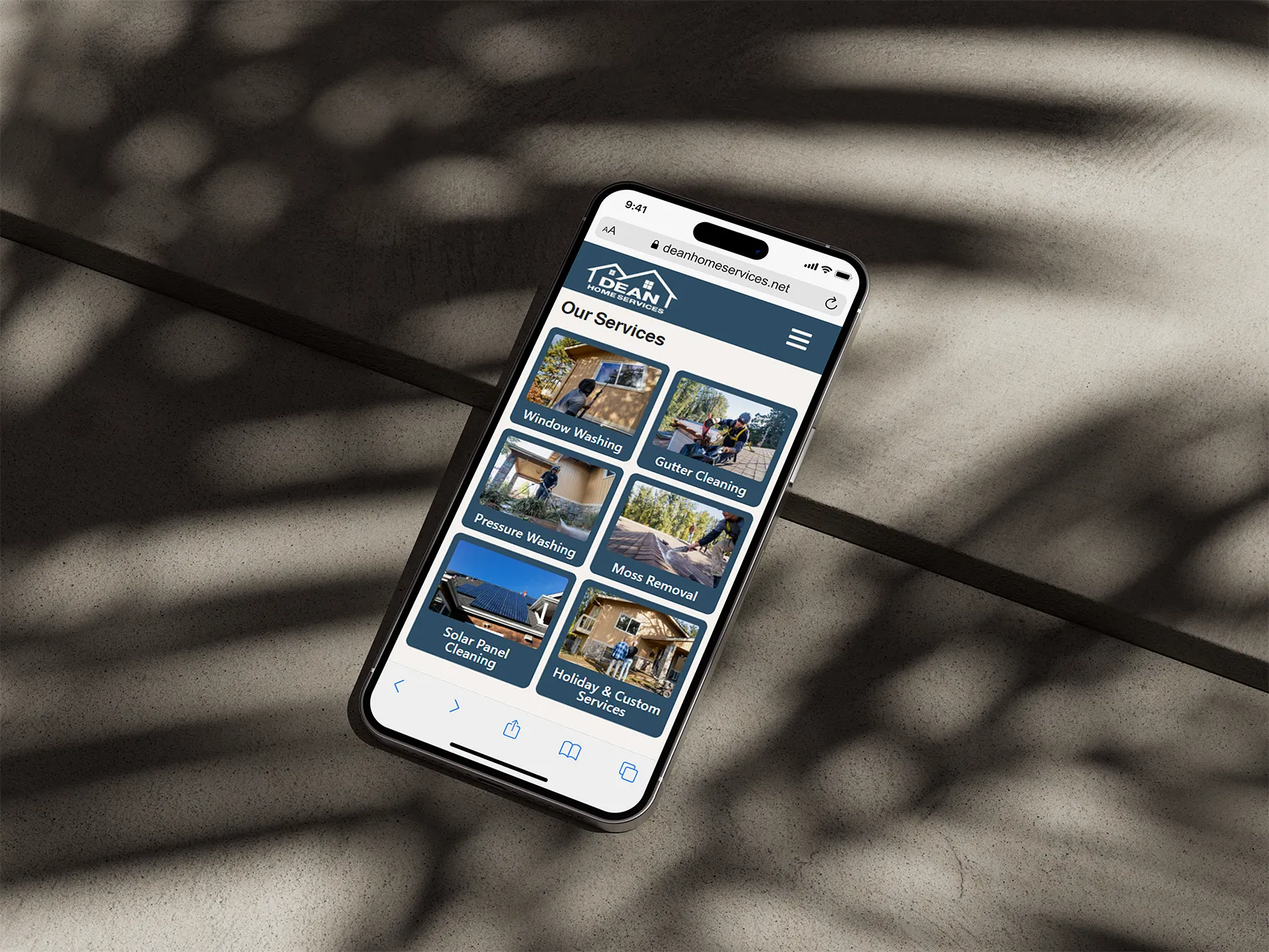
A growing Eugene, Oregon home services company needed a modern website designed to generate more qualified leads and streamline their booking process. Through strategic Website Design for Home Service Companies, we built a digital platform focused on speed, clarity, and conversion.
Services: Website Strategy, Website Design & Development
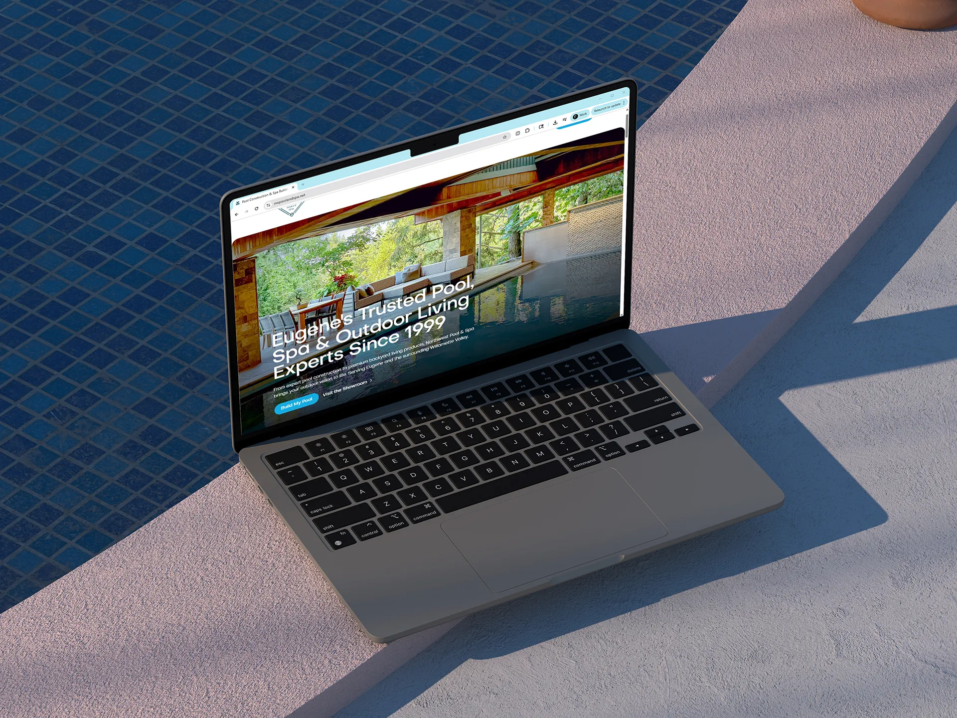
A high-end pool and spa construction company in Eugene, Oregon needed a modern digital presence to reflect the quality of their work and reconnect with their ideal clients. Through Website Strategy and Construction Web Design, we rebuilt their website to support a more premium, conversion-focused experience.
Services: Website Strategy, Website Design & Development