Why Construction Companies Need a Brand Identity System — Not Just a Logo
Most conversations about construction company branding start and end with the logo. Does it look professional? Does it communicate what the company does? Is it different from the competitors?
Those are reasonable questions. But a logo in isolation is not a brand. It is one piece of a system — and without the system, the logo cannot do the job that brand presence actually needs to do for a construction company.
The work we did with E&Z Construction in Eugene, Oregon is a useful illustration of what a complete identity system looks like, and why it matters more than most contractors expect.
Think through the full range of places a construction company's brand appears in the course of normal business:
The side of a truck, read at highway speed from fifty feet away. A business card handed over at a pre-bid meeting. A proposal submitted alongside three other qualified contractors. The website reviewed by a project owner before a first conversation. A job site banner visible to a neighborhood for six months. A hard hat and safety vest worn by every person on the crew. Social media posts showing project progress. Email signatures on every message the company sends.
Each of those contexts has different requirements. The truck wrap needs something legible at distance and in motion. The business card needs something that works at a tiny scale. The proposal needs something that reads as professional and serious in a formal context. The job site banner needs something that builds community recognition over time. The construction website needs to build trust and reputation.
A logo that was designed in isolation, without thinking through how it scales, how it reproduces in different colors and on different materials, how it works alongside photography and other visual elements, will fail some of these contexts even if it works well in others.
A brand identity system is what makes the logo work across all of them.
A full brand identity system for a construction company typically covers:
The logo system. Not just a primary mark, but the full set of variations needed for real-world use — a horizontal lockup, a stacked version, an icon or monogram for applications where the full name is too large, and clear rules for when to use each. Most logos need at least three to four variations to cover the range of applications a construction company encounters.
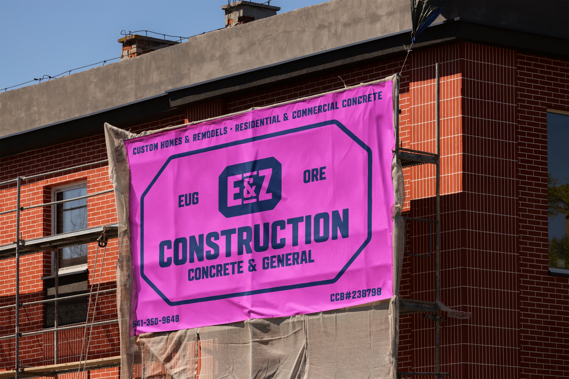
Color palette with application rules. A primary color, secondary colors, and explicit guidance on how they are used together — which combinations are approved, which are not, and how colors behave across different materials (screen versus print versus vinyl versus embroidery). For E&Z, this work was central to making the blue and pink palette function the way it needed to across a wide range of applications.
Typography system. The fonts that represent the brand across all contexts — headlines, body copy, proposals, signage — and the rules for how they are combined. Typography is one of the most overlooked elements of construction company branding and one of the most immediately visible signals of whether a brand was built with intention.
Visual language and graphic elements. The additional design elements — patterns, textures, shapes, dividers, background treatments — that give the brand system the building blocks to create consistent visual materials without requiring a designer every time.
A brand standards guide. The document that captures all of the above in one accessible reference — so every person applying the brand, whether it is an internal team member or an outside print vendor, has what they need to do it correctly.
The vehicle wrap is one of the most interesting brand applications for construction companies because it forces clarity about whether the system is actually working.
A wrap design exposes every weakness in a logo or color system. Colors that look fine on a screen can become muddy or indistinct on vehicle vinyl. A logo that works at standard sizes can fall apart when scaled to the side of a full-size truck. Typography that reads clearly in a proposal becomes illegible in motion.
For E&Z Construction, the vehicle wrap project was the catalyst for addressing the brand more comprehensively — because it was immediately clear that the existing identity was not going to hold up at that scale and in that context.
The refined palette — with the deep blue base and the high-visibility pink highlight — was designed with the partial wrap application in mind from the start. The result is a vehicle that is distinctive, legible, and impossible to confuse with any other contractor on the road. In a market where most construction company trucks are variations of the same white-truck-with-a-logo formula, that distinctiveness is a genuine competitive advantage.
One of the design principles we applied throughout the E&Z project was building the system with expansion in mind. The company is growing and will move into new types of work, new markets, and new brand applications over time.
A brand system built for a specific moment in a company's growth gets rebuilt when the company outgrows it. A system built with flexibility — clear rules, scalable visual language, a palette that works across a wide range of applications — grows with the company rather than constraining it.
For E&Z, that meant making deliberate choices about which elements of the system were fixed and which were flexible, how new applications could be created by someone following the guidelines without recreating the brand from scratch, and how the identity would hold up as the company adds people, adds equipment, and adds capability.
That kind of thinking is the difference between a brand that works for a few years and one that works for decades.
If your construction company has a logo but not a system — or if the system you have was never fully documented or built out — the most common symptom is inconsistency. Different versions of the logo appearing in different places. Color variations that no one intended. Proposals that look slightly different from the website, which looks slightly different from the truck wrap.
That inconsistency has a cost. It is not dramatic, but it accumulates. Every inconsistent impression slightly erodes the sense that this is a company that has its act together — which is one of the most important signals a construction company can send.
The good news is that building a complete system from an existing logo is usually faster and less expensive than starting from scratch. Most construction companies already have the foundation. What they are missing is the system around it.
Learn about our construction company branding work.
Read the full E&Z Construction project here.