
Location:
Portland, Oregon
Type of Work:
Brand Identity
Completion Date:
June 2026
Portland, Oregon
Brand Identity
June 2026
OrangeWall Studios and Waterleaf Architecture had each built strong reputations in the Portland, Oregon AEC market over decades of practice. OrangeWall Studios brought a distinctive design sensibility and a focused body of work. Waterleaf Architecture brought institutional depth and a long track record across commercial, transportation, and community-focused projects.
The decision to merge was years in the making. By the time Fairbuilt was brought in, through an introduction from Russell at TRD Enterprises, who had been working closely with both firms through the process, the business case for the merger was settled. What was not settled was everything the brand needed to be.
The merged firm needed a new name. A new visual identity. A position that could hold together the histories of both practices while communicating clearly to the next generation of clients, candidates, and collaborators. And it needed all of that while managing eight principals, each with a legitimate stake in the outcome and a different perspective on what the new firm should feel like.
This was not a straightforward rebrand. It was a brand built at the intersection of two legacies, a leadership transition, and a new chapter that none of the individuals involved had experienced before.
Eight Stakeholders, Two Legacies, One Brand
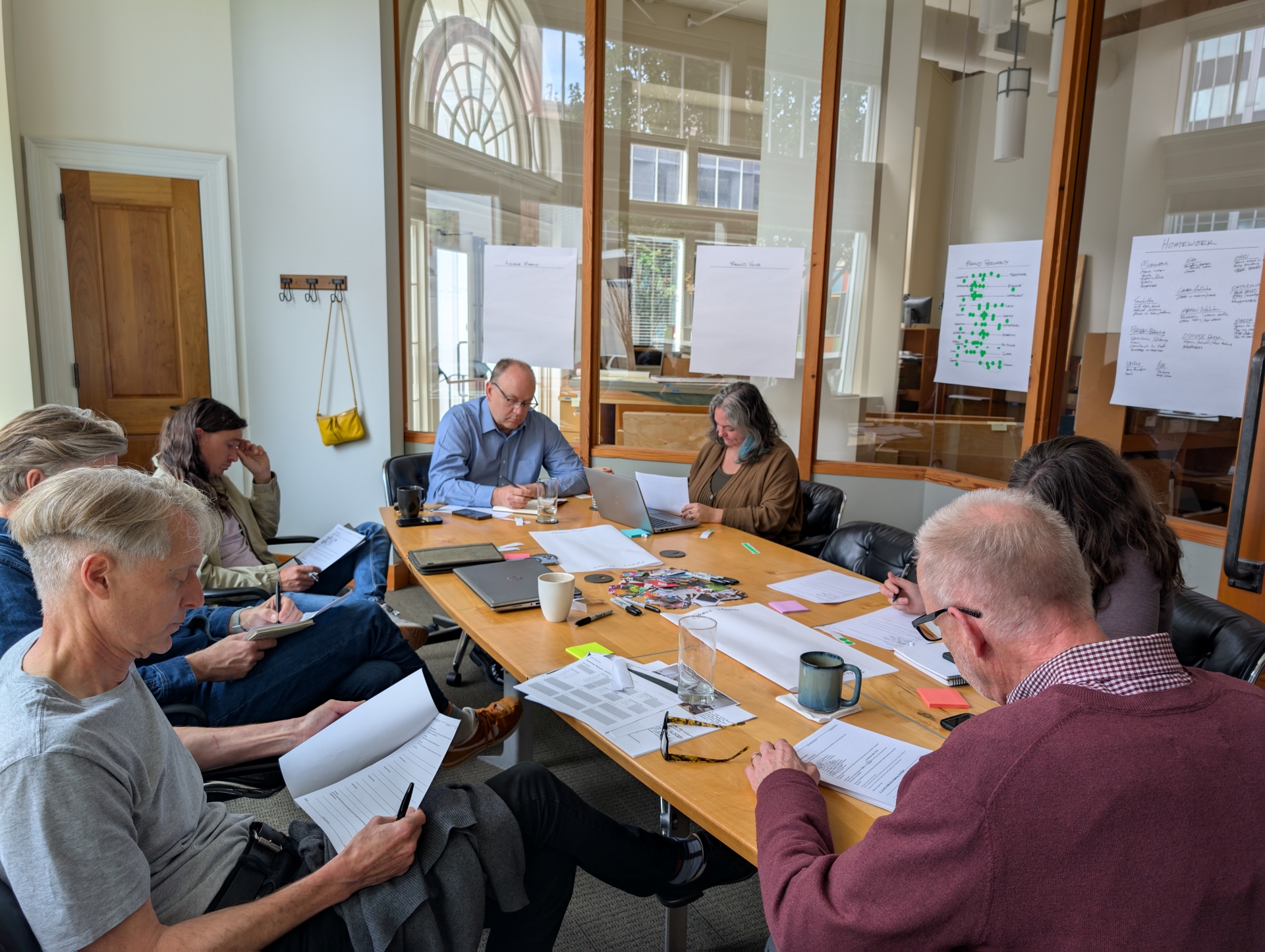
The complexity of this project was not primarily a design challenge. It was a strategic and facilitation challenge.
With eight decision-makers, founding principals stepping back, emerging leaders stepping forward, and everyone in between, the brand process had the potential to stall on competing visions before a single mark was drawn. Different people had different attachments to the existing firms' identities. Different people had different ideas about what the merged firm should prioritize. And the generational dynamic, older leadership transitioning out, newer leadership taking the reins, added an emotional layer that pure design thinking could not resolve.
The brand workshops we ran were designed to surface and work through those differences before they became design feedback. Naming exercises, positioning frameworks, values alignment sessions, competitive landscape review — all of it structured to move eight people with different starting points toward a shared understanding of what the new firm was and what it needed to communicate.
That process took time. It also produced something more durable than a brand that was designed first and explained to stakeholders later. It produced a brand that leadership had built together, which meant they were invested in using it correctly from day one.
We began where we always begin: strategy. Before any visual work started, we needed answers to questions that the merger itself had left open.
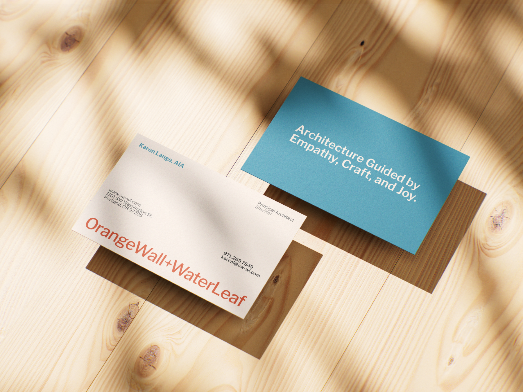
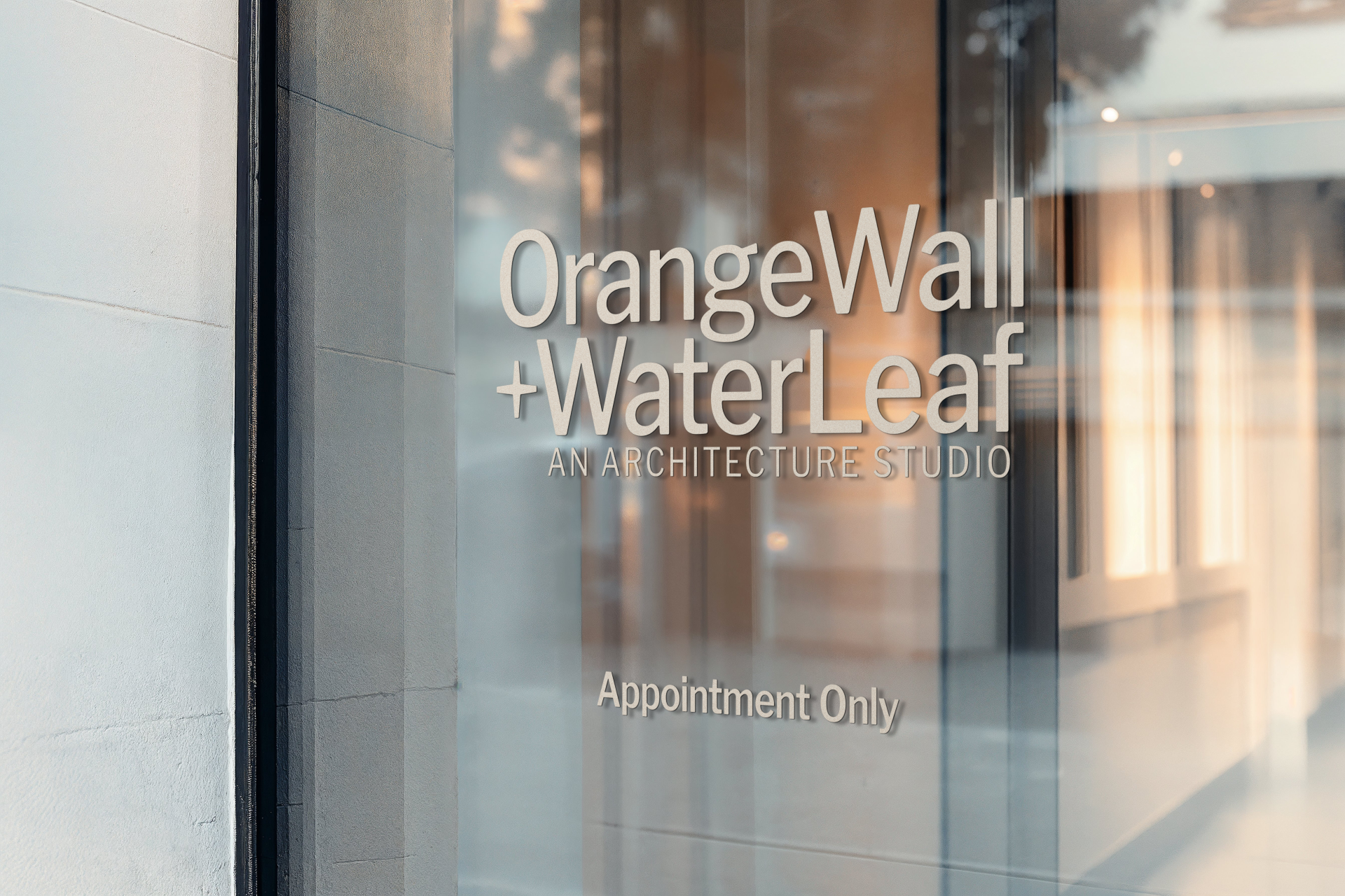
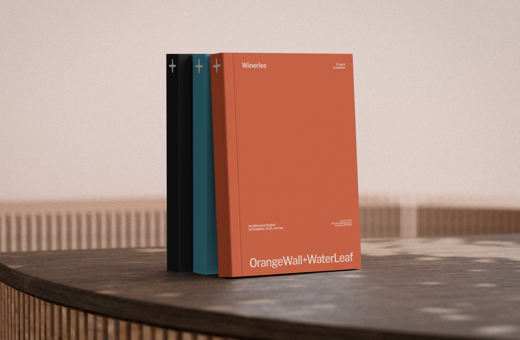
What would the merged firm be called? The naming process required honoring both legacy firms while creating something that could stand on its own. The solution was elegant in its directness: OrangeWall+WaterLeaf an Architecture Studio. The plus sign, which became a central design element in the identity, acknowledged the additive nature of the merger rather than erasing either firm's history. The full name was long by convention standards, but it was honest, and it gave the firm a memorable, ownable identity that no one in the Portland market could confuse with anything else.
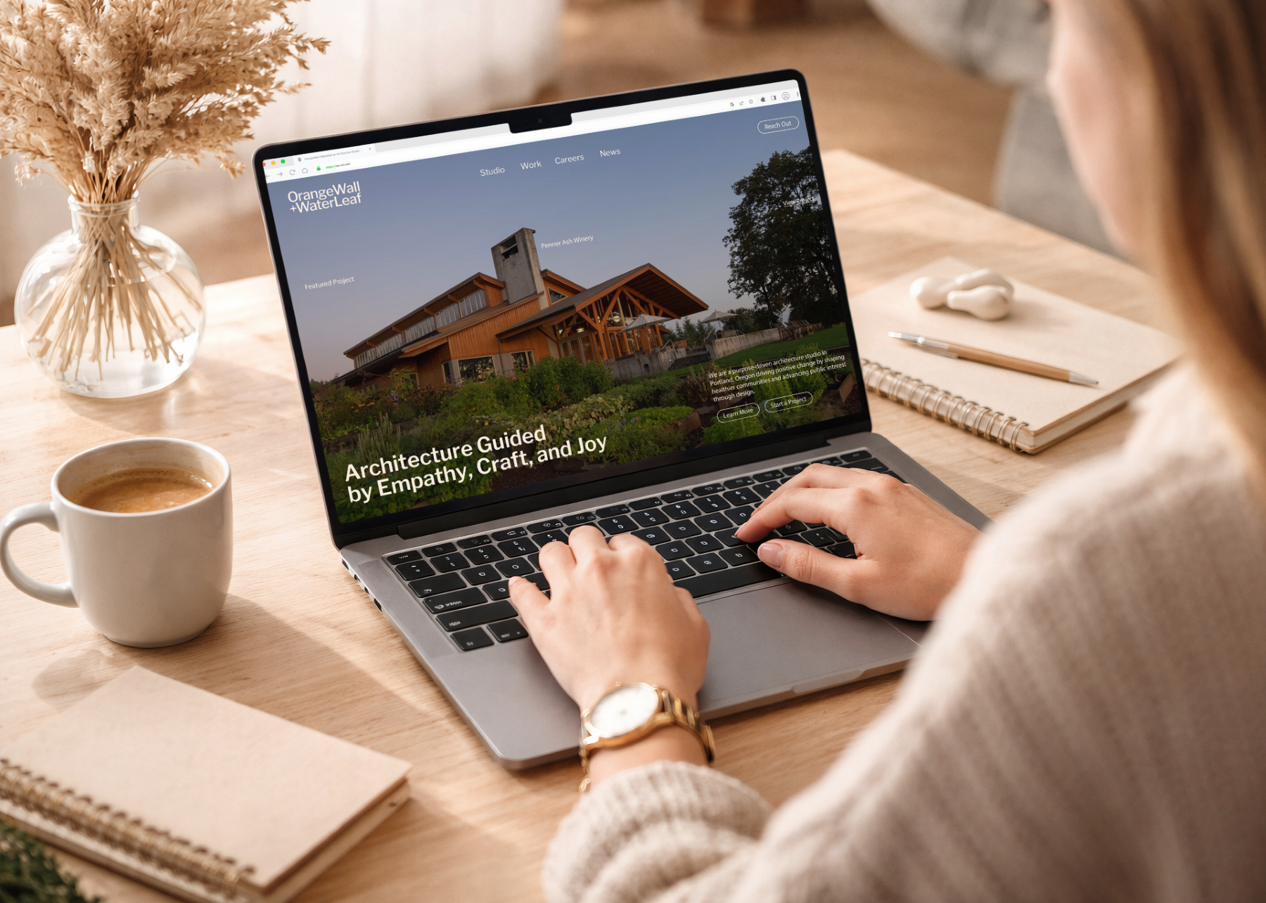
With the name established, we moved into positioning. The merged firm's strengths were clear: deep experience across a wide range of project types, a disciplined design approach, a commitment to sustainable practice, and a team that spanned generations in a way that positioned the firm for long-term stability. The positioning we built was grounded in those realities, forward-looking without abandoning the credibility that decades of work had earned. Architecture guided by empathy, craft, and joy.
From the positioning, we developed the visual identity. The direction was editorial, a strong, confident wordmark combined with a distinctive "+" symbol that was architectural in its precision and flexible enough to carry significant visual weight across every application. The color system embraced the histories of both firms: orange and blue as primary colors, bright and bold, chosen deliberately to signal the energy of the merged practice rather than the restraint of either predecessor.
Typography, layout systems, supporting graphic elements, and brand standards followed, all built to give the new leadership team the tools to apply the brand consistently as the firm grows into its next chapter.
The Phase 1 engagement produced a complete brand identity system for OrangeWall+WaterLeaf an Architecture Studio, naming, positioning, visual identity, and brand standards, that the full leadership team had shaped together and was ready to use.
The response from the team was immediate. The brand felt like the firm they had built together, not like something imposed on them. The "+" mark in particular resonated as a symbol of what the merger actually represented, not a takeover or an acquisition, but a genuine addition of two practices becoming something more than either was separately.
Marketing materials developed from the new identity are in use. Phase 2 — website design and development — is in progress and will extend the brand into a digital presence built for the merged firm's full capability and the leadership generation that will carry it forward.
This project is exactly the kind of engagement Fairbuilt was built for. A firm at a genuine inflection point. A brand challenge that required as much facilitation as design. A team that was ready to embrace a new identity, a new positioning, and the next chapter of the practice.
The website phase of this engagement is currently in development. This page will be updated when Phase 2 launches.
A Portland-based urban design initiative needed a brand and website to support the second iteration of its micro-park system. Through Brand Strategy, Brand Identity, and Website Design, we helped position Stay on the Grass as a leader in urban greening and community-driven placemaking.
Services: Brand Strategy, Brand Identity, Website Strategy, Website Design & Development
A second-generation home builder in Salem, Oregon needed a brand and website that reflected the future of the company while honoring its reputation. Through Construction Branding, Brand Strategy, and Construction Web Design, we created a modern identity built to support the next chapter of growth.
Services: Brand Strategy, Brand Identity, Website Design & Development